Fast Track AI (2025)

Advanced Dropdown Builder

From 200+ option chaos to intelligent progressive disclosure

Advanced dropdown builder interface showing category selection and field metadata

Impact

  • Selection efficiency improved dramatically: single-field picks dropped from 60+ seconds to under 5 seconds, and multi-condition segments now save minutes per build. This compounds across hundreds of daily selections platform-wide.
  • The component became entirely self-explanatory, eliminating the need for separate support documentation. New operators could use it without training, which reduced onboarding overhead significantly.
  • Adoption was platform-wide within a quarter. The pattern became the reference standard for complex selections across Segment Builder, Trigger Builder, Data Explorer, Campaign Creator, and Journey Designer.
  • The component has been stable for over 12 months with no material rework needed, validating that the upfront investment in research and architecture paid off.
Dashboard showing platform-wide adoption metrics
Adopted across all modules within one quarter
Timeline
Q2 2025 (single quarter delivery)
Team
5 (Product Design lead, 2 Engineers, QA, Product Manager)

The Problem

Fast Track AI's iGaming CRM processes millions in daily transactions. Our data selection interface had become a bottleneck that was actively hurting both user productivity and data accuracy. With over 200 data fields scattered across an alphabetical dropdown, users spent too much time hunting for their metrics. In iGaming, second-guessing costs money.

Core Issues:

  • Poor Information Architecture
    200+ fields dumped in pure alphabetical order with no logical grouping. Last Login Date sitting next to Locked Bets, completely unrelated metrics forced into proximity. Zero search functionality meant users scrolled endlessly, and there was no context for what fields actually meant until after selection.
    Impact: Decision paralysis, frequent mis-selections, wasted time
  • Cognitive Overload
    Similar field names caused constant selection errors (Last Login Date vs Last Login Date Difference vs Last Login Date Functions). Free-text date entry created inconsistent formats and silent calendar corrections. Users could not mentally map the options to their actual needs.
    Impact: Errors requiring rework, broken segments, frustrated operators
  • Technical Debt
    Legacy component was incompatible with the design system, had poor performance with large datasets, no caching strategy, and accessibility failures. New fields were added monthly with no organization strategy, and partner-specific custom fields got lost in the alphabetical maze.
    Impact: Scalability issues, partner complaints, training overhead increasing with every field addition

Why It Mattered:

  • In iGaming CRM, precision is non-negotiable. Mis-selecting a segment or trigger input can mis-target campaigns at scale
  • Not knowing which data to analyze can leave operations in darkness, costing real money
  • Our legacy component had not been touched since early platform days and carried usability, performance, and scalability debt
  • Partner complaints about usability were increasing, and selection errors were costing time and money

My Approach

1. Progressive Disclosure Over All-at-Once

Decision: Three-step flow: category, then field, then values

Rationale: Operators told us they do not always remember exact field names. They want to browse. By breaking the selection into logical steps, users could navigate by intent rather than needing to recall specific terminology. This mirrors natural decision-making: broad to specific.

Result: The interface teaches as you use it. Users discovered fields they didn't know existed, which led to better segments.

2. Real-Time Context at Decision Point

Decision: Show audience coverage, sample values, and data type hints as you select

Rationale: Users wanted to see the impact of their selection before committing. Without this context, they were second-guessing themselves and making errors that required rework.

Result: Reduced second-guessing and mis-selections. Users could validate their choice without completing the full flow.

3. Eliminate Free-Text Inputs

Decision: Calendar widgets for dates, validated number inputs, unit selectors. No arbitrary text entry.

Rationale: Free-text entry for dates caused format drift and out-of-range values that broke segments. Typed dates also triggered silent calendar corrections that confused users.

Result: Invalid selections dropped to near zero, and error handling became dramatically simpler.

4. Browse-First with Search as Assist

Decision: Prioritize category browsing over search-first interface

Rationale: Most users did not know the exact field name they needed. Active discovery of adjacent fields led to better segmentation than going directly to a known field. Search is present but not primary.

Result: Users learned the data model while selecting, not just before.

Six-card grid showing strategic approach: Progressive Disclosure Pattern, Information Density Balance, Category Sorting, Documentation Marathon, Deliverables, and Validation & Iterations
Strategic framework covering progressive disclosure, information density, taxonomy, documentation, deliverables, and validation

Key Design Decisions

Category Taxonomy

We mapped 200+ fields into 11 logical categories that match how operators actually work, not how the database is structured. Categories are named in operator language, and we allowed intentional duplicates where they improved findability. For example, Last Login Date appears in both Login and Date categories. This became a living document keeping design, engineering, and data aligned.

Contextual Information Density

Each step exposes exactly the context needed: audience coverage showing how many players are affected, value distribution snapshots with min/median/max/mean, sample values showing what the data looks like, and explicit data type indicators. The balance is enough signal to act quickly, never so much it slows you down.

Type-Aware Inputs

Each data type gets appropriate controls. Dates use absolute or relative pickers only, with free text disabled and a past date constraint. Time ranges use frequency shortcuts and validated numeric entry. Booleans are explicit switches, strings are searchable with samples, and integers surface stats and quantiles with bounds to steer sensible filters. Condition labels stay consistent across the entire product.

State Persistence and Suggestions

The empty state shows auto-saved suggestions from previously used configurations. Selecting a recently used option reveals its definition, sample values, data type, and live audience coverage immediately. This rewards repeat usage and reduces time for common workflows.

Visual Hierarchy for Complex Configurations

The most complex configurations, such as third-level fields with multiple parameters, maintain clear steps and always show a description of what is being configured. The compact representation updates automatically as selections are made, so users always know their current state.

Implementation

Technical Approach:

  • Built as a modular React + TypeScript component family integrated into the design system with strict type contracts
  • Component ships as a typed package with context providers for configuration and data hydration
  • Metadata is cached daily and lists are virtualized for performance with large taxonomies
  • Searches are debounced and highlighted, with sub-50ms interaction targets for common paths
  • API contract exposes field schema, examples, and distributions
  • Analytics events capture adoption and error states for continuous improvement
  • Accessibility compliance verified with screen readers and keyboard navigation

Rollout Strategy:

  • Weeks 1-3: Ideation
    • Gathered evidence from support tickets and partner feedback
    • Built comprehensive field dictionary with human-readable labels, data types, sample values
    • Conducted card sorting to validate categorization against operator mental models
    • Prototyped three approaches: search-first, browse-first, and hybrid
  • Weeks 4-9: Platform Integration
    • Embedded component in Segment Builder, Trigger Builder, Data Explorer, Campaign Creator, Journey Designer
    • Maintained single source of truth for field definitions across all modules
    • Integrated analytics hooks for adoption and error tracking
    • Iterated on category names and resolved overlapping placements pragmatically
  • Weeks 10-12: Rollout
    • Simultaneous release across all touchpoints to avoid UX drift
    • Published documentation on day one
    • Ran partner enablement sessions to gather immediate feedback
    • Monitored real-world usage and error telemetry in production
Empty state showing recently used field suggestions
Empty state surfaces previously used fields so repeat workflows start fast
Recently used field selected with metadata panel visible
Selecting a recent field immediately shows its definition, sample values, and audience coverage
Category list expanded showing all available categories
Guided selection reveals all categories at a glance, with search available for those who prefer it
Category selected with alphabetized field list
Picking a category narrows the list to relevant fields, ordered alphabetically within that group
Field selected showing usage description and properties
Each field comes with a plain-language description so users know what they are selecting
Different field showing distribution stats and sample values
Different fields surface different properties: distributions, min/max, sample values as appropriate
Date category selected showing date-specific fields
Date fields get their own category for quick access when time-based segmentation is the goal
Date picker with interval and frequency selectors
Selecting values happens through dedicated controls. No typing means no format errors.
Birth date field showing different input method
Different date fields have different input methods depending on their typical use case
Full calendar widget for precise date and time selection
When precision matters, a full calendar widget lets users pick dates down to the minute
Third level field selection with period picker
Third-level fields follow the same pattern with an additional step, keeping the experience consistent
Fully configured complex selection with all parameters visible
Even the most complex configurations show clear steps and a description of the selected field

Process

Discovery: Gathered evidence from support tickets and partner complaints. Found that the legacy component had not been touched since early platform days and was creating compounding issues.

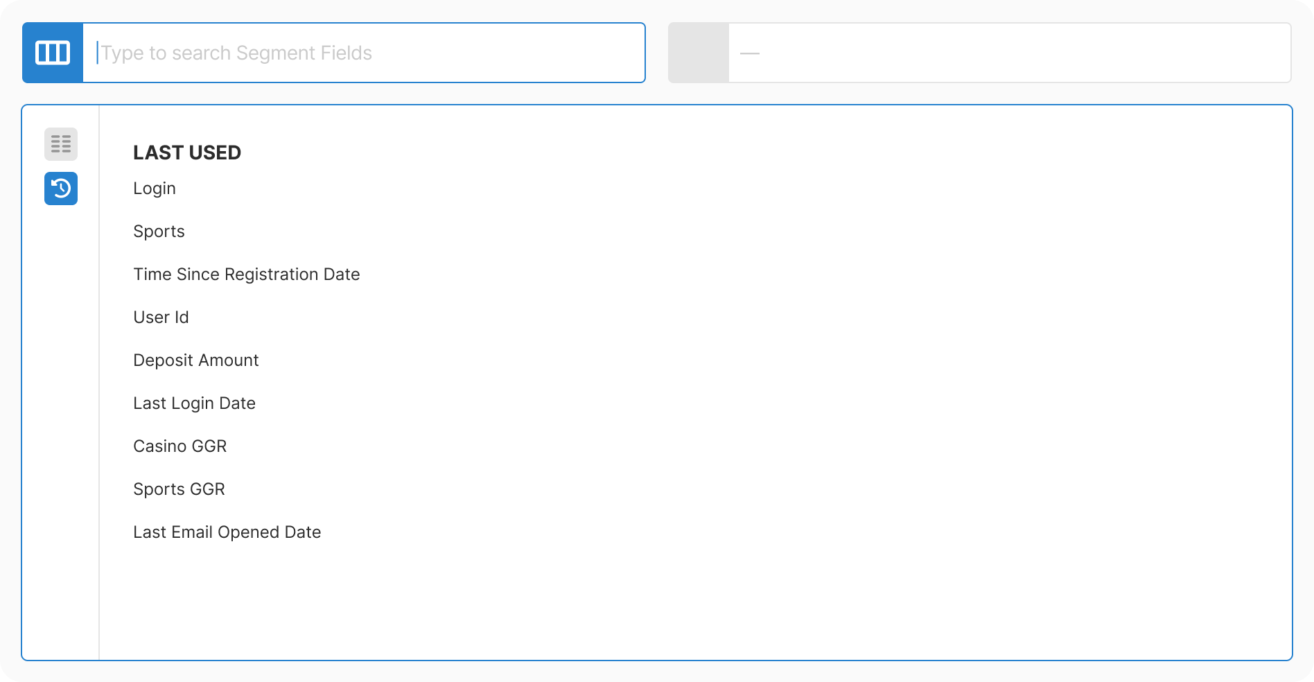
Research: Conducted card sorting with operators to understand mental models. Tested three approaches: search-first, browse-first, and hybrid. Browse-first won for this use case.

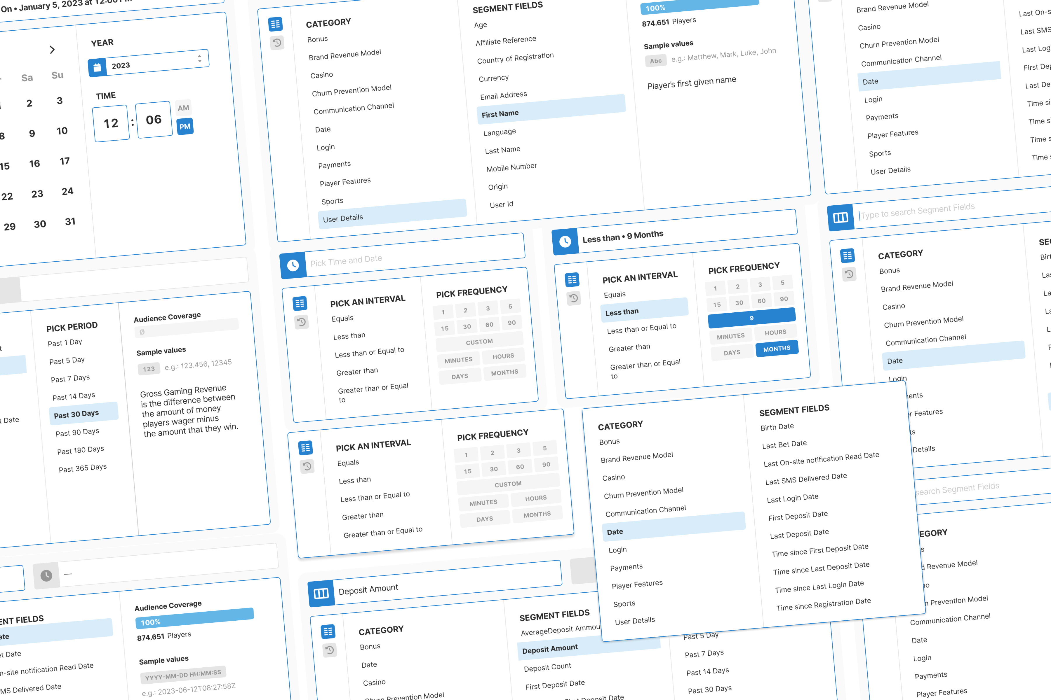
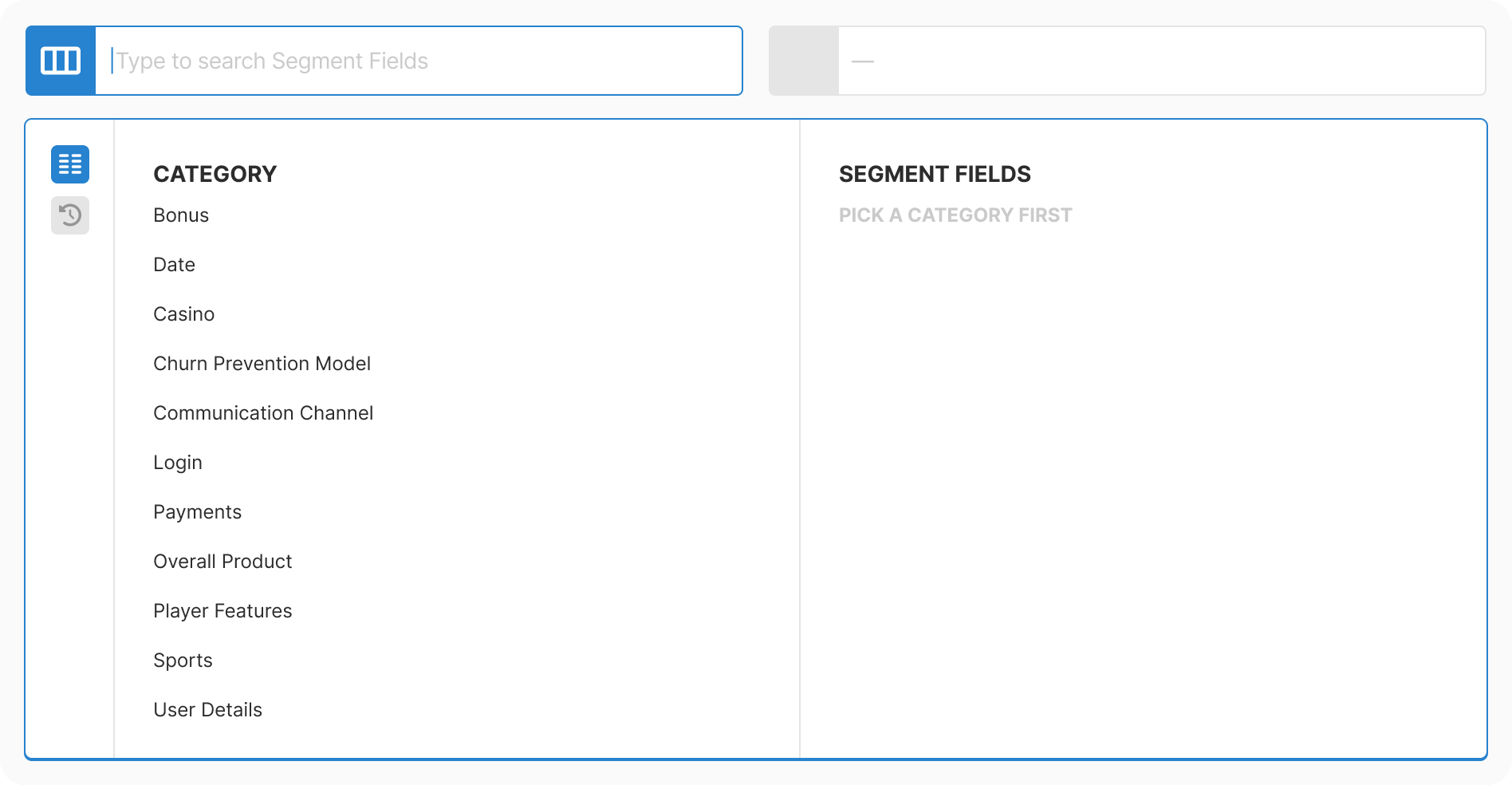
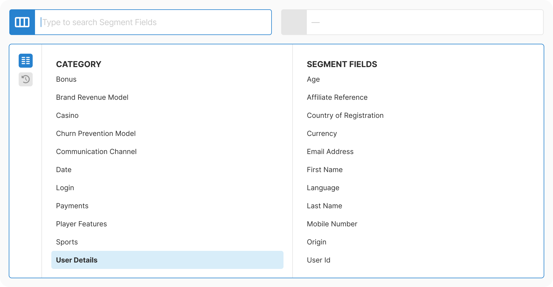
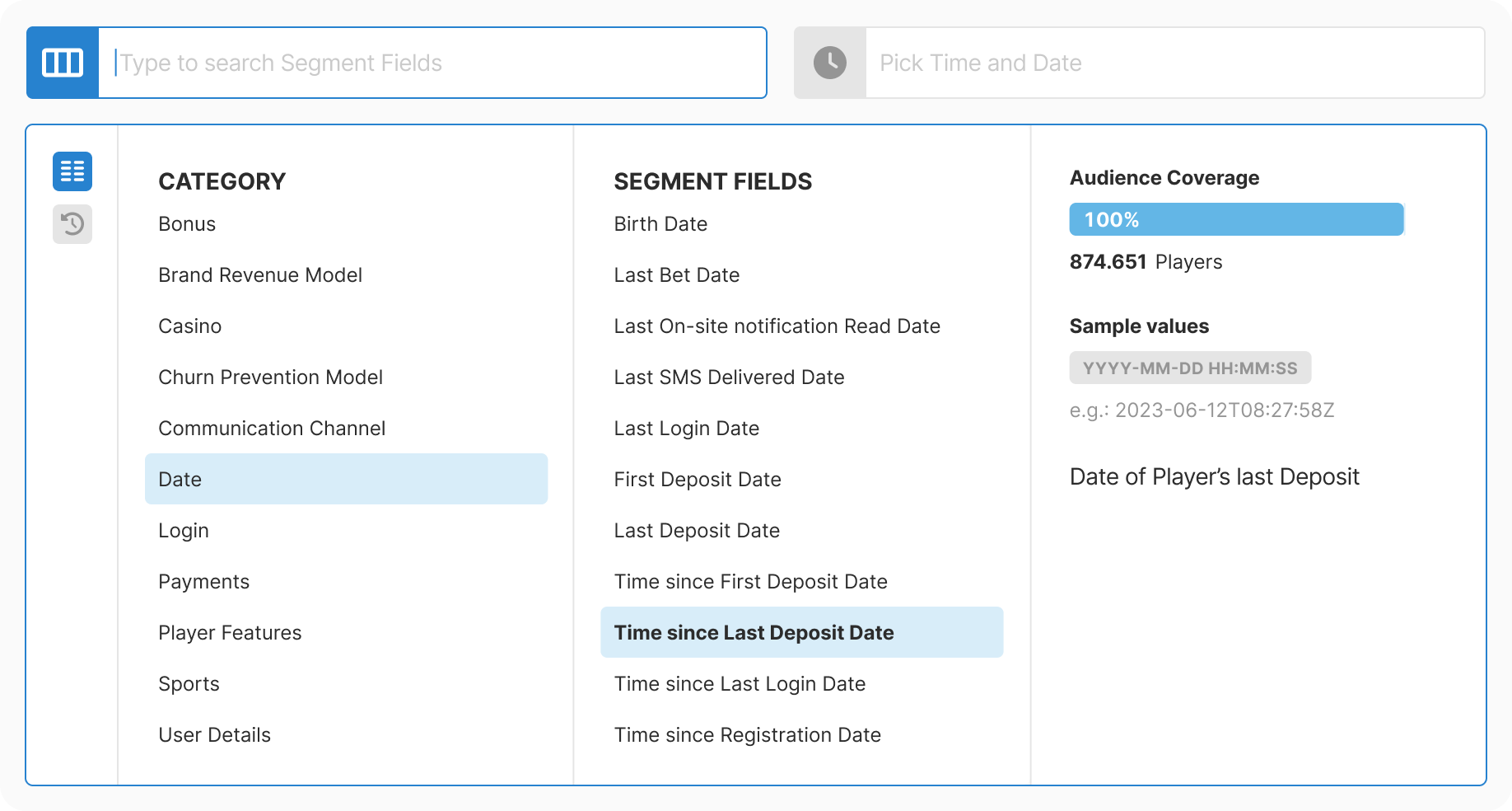
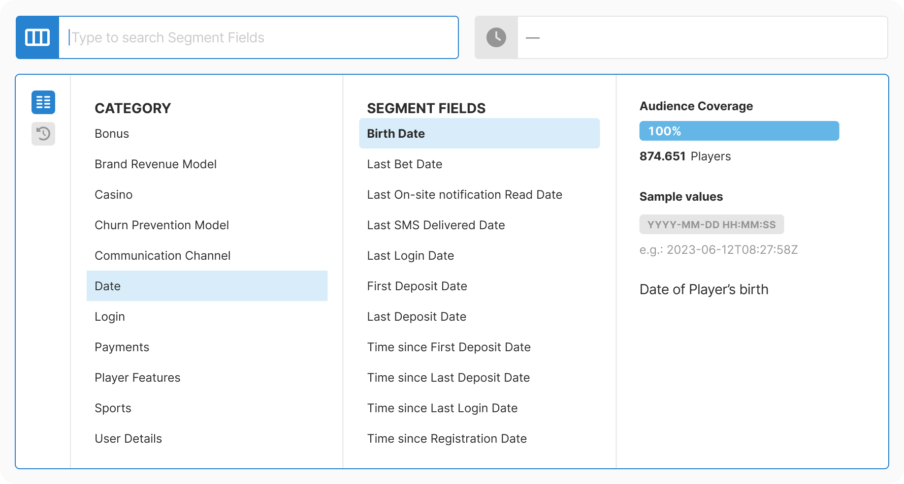
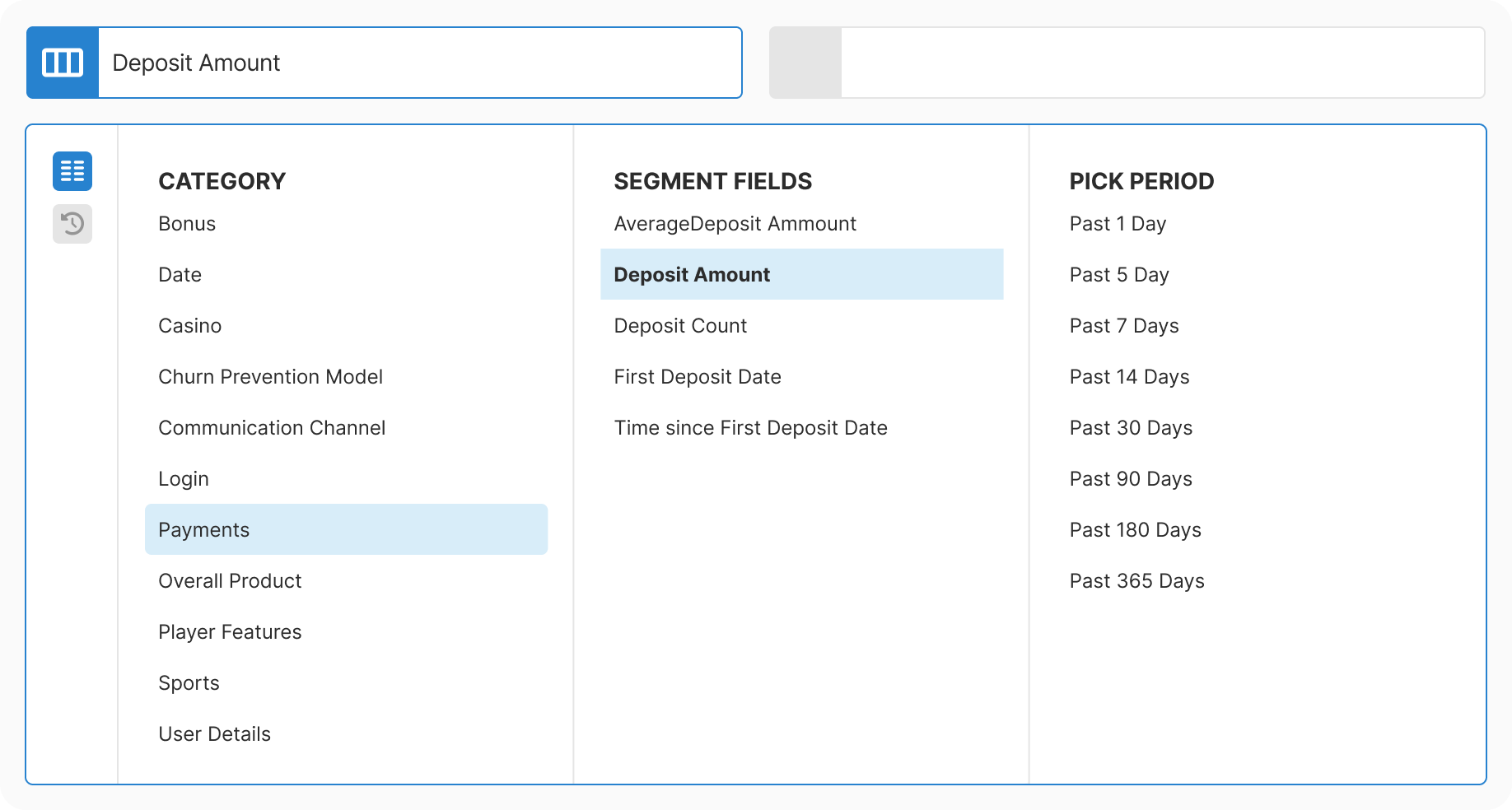
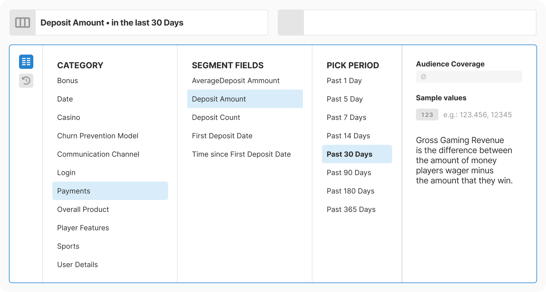
Taxonomy: Mapped 200+ fields into 11 logical categories. Combined database extraction with manual enrichment. Allowed intentional duplicates where findability improved.

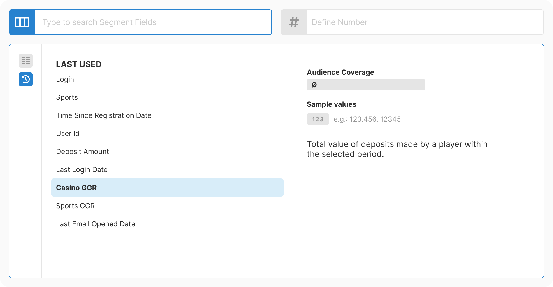
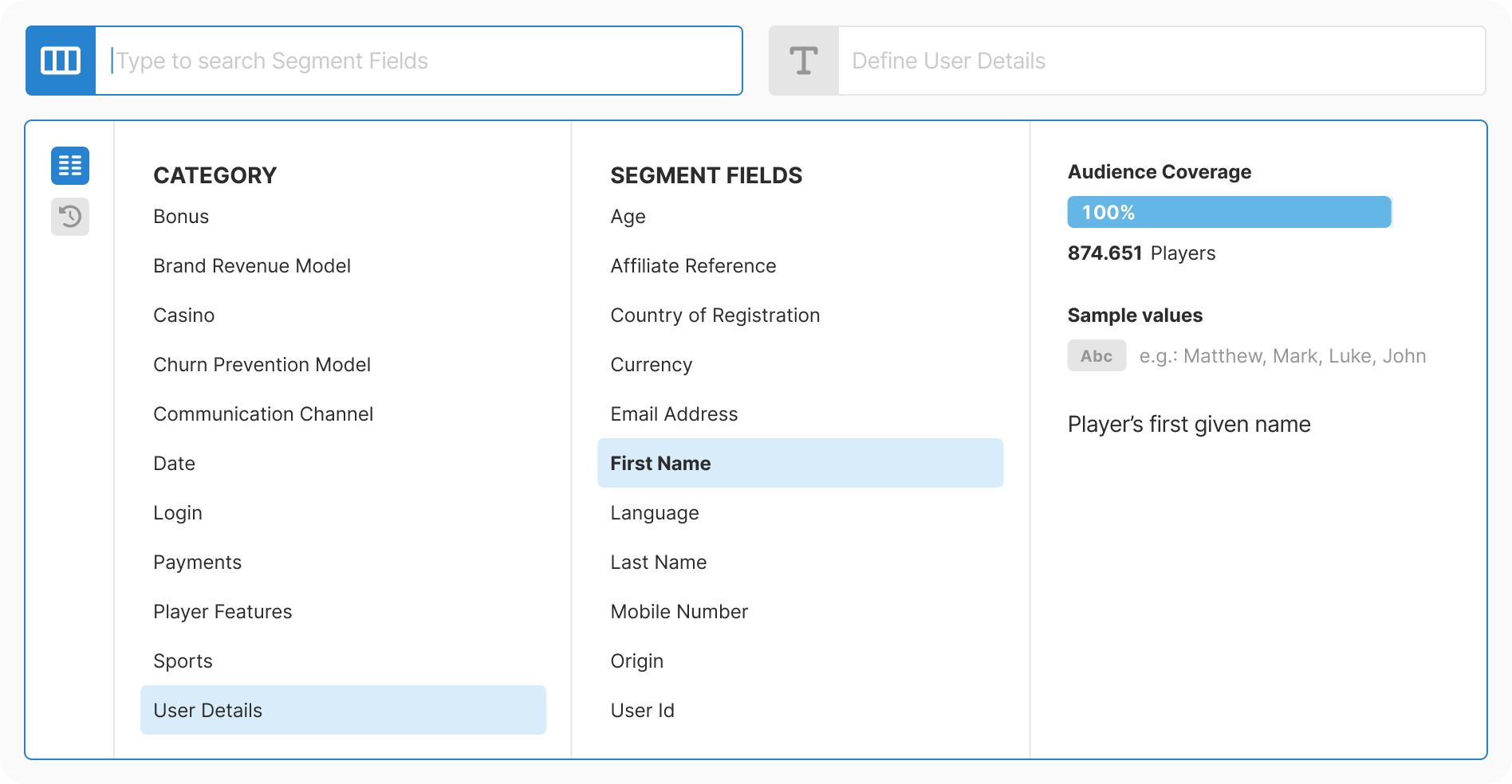
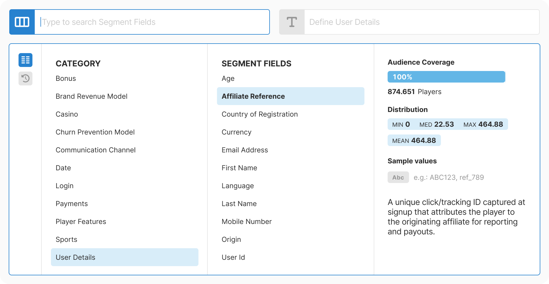
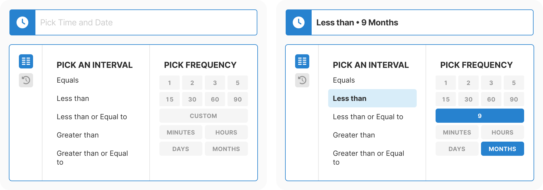
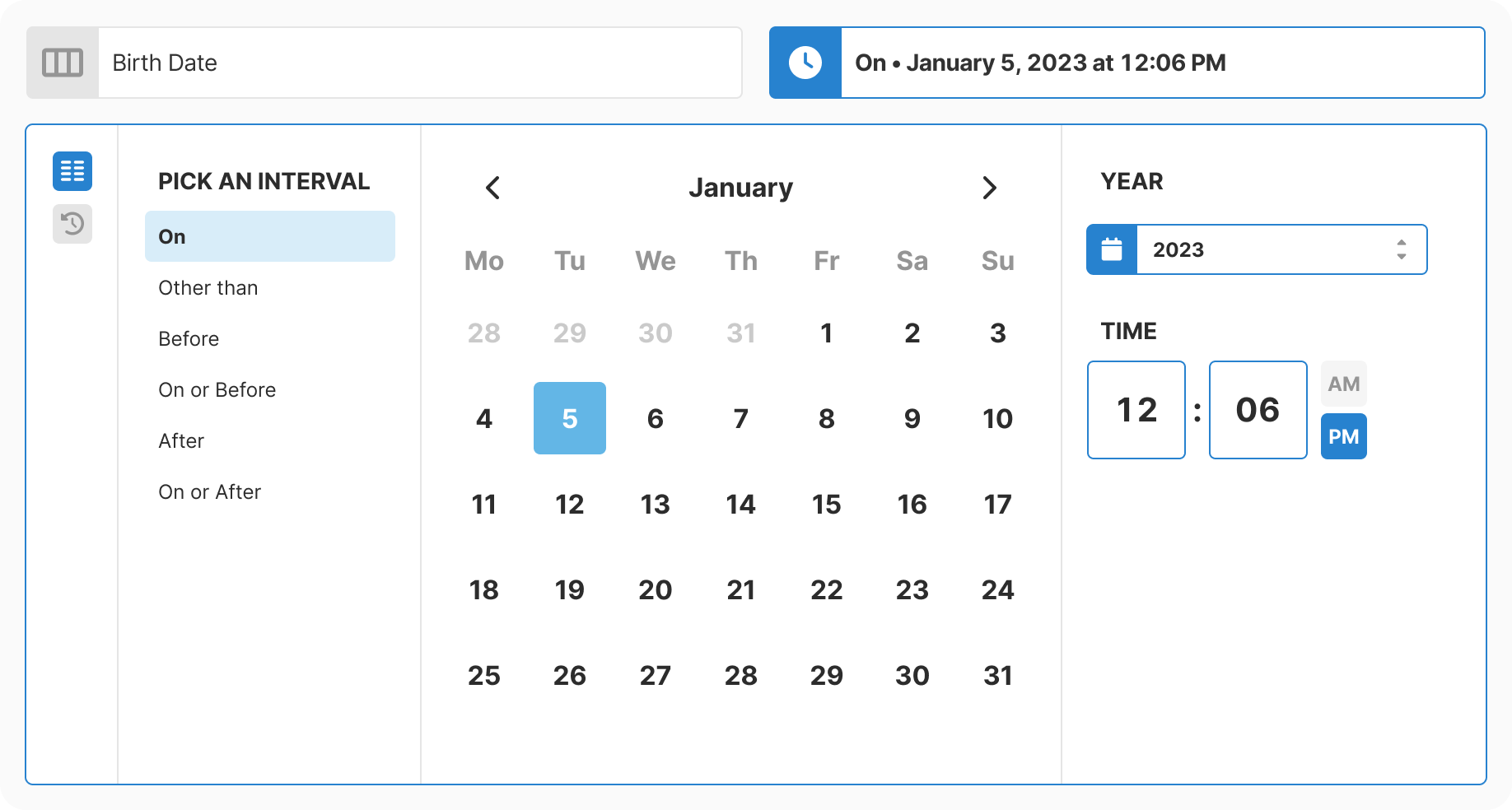
Design: Created progressive three-step flow with real-time context at each decision point. Removed all free-text inputs. Added type-aware controls for each data type.

Development: Built as reusable component with strict type contracts. Optimized for performance with virtualization and caching. Integrated analytics from day one.

Rollout: Simultaneous release across all touchpoints to avoid UX drift. Published documentation immediately. Ran partner enablement sessions.

Validation: Monitored adoption and error telemetry in production. Zero critical incidents. Pattern adopted by other teams as reference standard.

Validation & Results

Measured Outcomes:

  • Efficiency Gains
    • Single-condition selection time reduced by an order of magnitude for typical flows
    • Complex segments saved minutes per build, recovering significant weekly hours platform-wide
    • Eliminating free-text dates and enforcing validated units removed a frequent source of support tickets
  • Quality Improvements
    • Fewer mis-selections due to clearer labels, previews, and type-aware inputs
    • Removal of free-text dates eliminated format confusion and silent corrections
    • Invalid segment configurations dropped dramatically
  • Adoption
    • Rolled out to 100% of relevant modules within one quarter
    • Increased usage of flagship features that were previously buried under countless metrics
    • Component adopted by other product teams as reference pattern

Technical Success:

  • Zero critical incidents occurred post-launch, validating the careful architecture approach
  • No material rework needed for 12+ months, confirming the taxonomy held up to real usage
  • Performance targets met consistently. Interactions feel instant even with 200+ fields
  • Accessibility audit passed on first review
User flow diagram showing the complete interaction sequence
The full flow from access to confirmation, with caching and validation at each step

What I Learned

What Worked:

  • Card sorting surfaced how people actually think, making category decisions obvious instead of arbitrary. The exercise paid for itself many times over in reduced iteration later.
  • Progressive disclosure slashed cognitive load. Users made faster decisions because they only saw relevant options at each step.
  • Proactive caching eliminated performance concerns before they became user-facing issues. The investment in virtualization meant we never had to apologize for slow interactions.
  • Cross-team collaboration on the field dictionary created alignment that extended beyond this project. It became a shared asset that other teams referenced.

Challenges Solved:

  • Overlapping categories where fields logically belonged in multiple places: Permitted intentional duplication where it improved findability, and documented the reasoning so future team members would understand the choice.
  • Documenting 200+ fields with accurate descriptions and sample values: Combined database extraction with manual enrichment, creating a living dictionary that stayed synchronized with the actual data model.
  • User feedback showing confusion over time conventions and autocomplete behavior: Removed typed dates entirely in favor of calendar selection with strict validation. Accepted the trade-off of slightly more clicks for dramatically fewer errors.
  • Internal resistance to changing a familiar (if flawed) interface: Reframed the work as platform modernization rather than criticism of the existing system. Demonstrated value with small wins before the full rollout.

Strategic Insight:

Infrastructure improvements compound. One taxonomy, one component, one source of truth; this consistency drove reuse across every team that touched data selection. The pattern set a higher bar for how we handle complexity. Performance should be felt, not seen. Documentation is leverage, not overhead.