#Mobile (2025–Present)

Codex Tarot

A pocket companion for tarot meditation, built to replace doom-scrolling with a moment of genuine reflection

A mobile app for tarot exploration that turned a functional web tool into a daily meditation practice. Built with React Native, animated cosmic backgrounds, and a three-stage AI reading flow that unfolds like a conversation. Now live on Google Play with Apple approval pending, monetized through a freemium model that gives everyone access to single-card readings while reserving deeper spreads for subscribers.

TimelineLate 2025 – Present (4 months active development)
RoleSolo: design, development, brand, distribution
Tech stack
React NativeExpoClaude AI APISupabaseNativeWind
Codex Tarot mobile app showing a three-card spread with animated card reveals against a dark nebula background

Mission

To turn tarot into a daily practice of reflection and self-examination, not fortune-telling but a structured way to externalize what is already inside.

The web version of Codex Tarot worked. People used it. The readings felt alive because the AI engine, built from 78 hand-documented cards, produced interpretations that genuinely connected with users' situations.

But the web app had hit a ceiling. A link in a bio is not how people discover tools they might use daily. The visual design was showing its age.

The bigger issue was reach and ritual. To find the worldwide audience that might benefit, I needed to be where people actually look for apps: the App Store and Google Play. It needed to sit on a home screen and send a gentle notification at 6:06 AM, becoming part of a morning routine rather than something you remember to visit.

The engine was solid. The research was done. The YAML documentation for all 78 cards, their meanings, relationships, and first-person monologues was complete.

What it needed was a new body, a proper stage, and a reason to open it every day.

  • Rebuild Codex Tarot as a mobile-first experience with distribution through the platforms people actually use to discover apps, turning a website into a home-screen presence
  • Honor the Marseilles deck as a tool for visual archetype exploration and meditation, framing it as structured reflection rather than divination or fortune-telling
  • Create something simple enough that users never need a tutorial but deep enough that they keep returning, with a Card of the Day feature that builds a daily practice
  • Ship fast by keeping scope ruthlessly tight and features minimal and polish high, then monetize sustainably through a freemium model that respects users who just want to dip in

Context

Visual archetypes are among humanity's oldest tools for reflection and meditation, used across cultures for religious contemplation, psychological diagnosis, and creative inspiration. Tarot sits in that lineage, whether we call it mysticism, pattern recognition, or simply a structured way to hold a mirror up to our own thoughts.

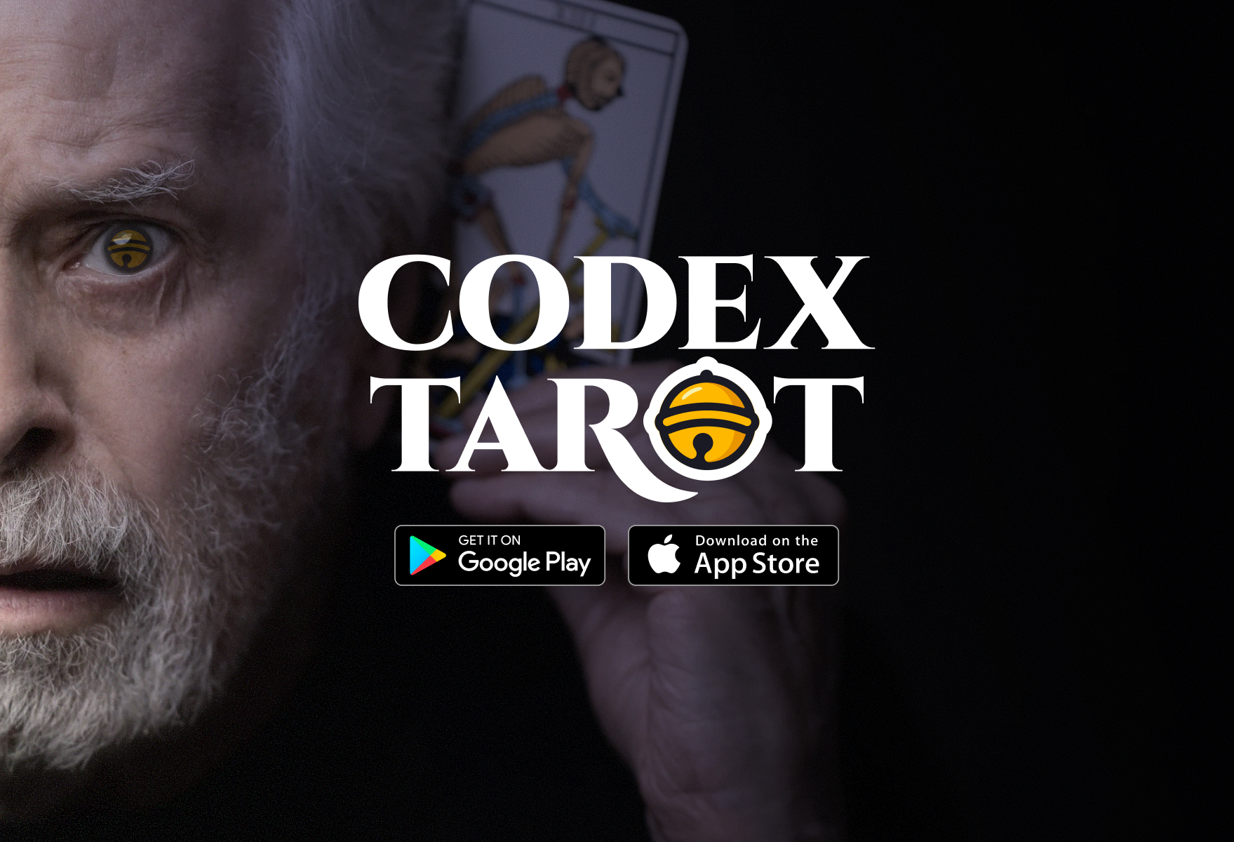
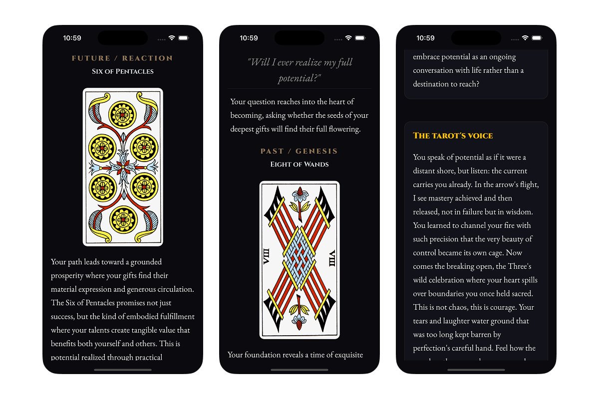
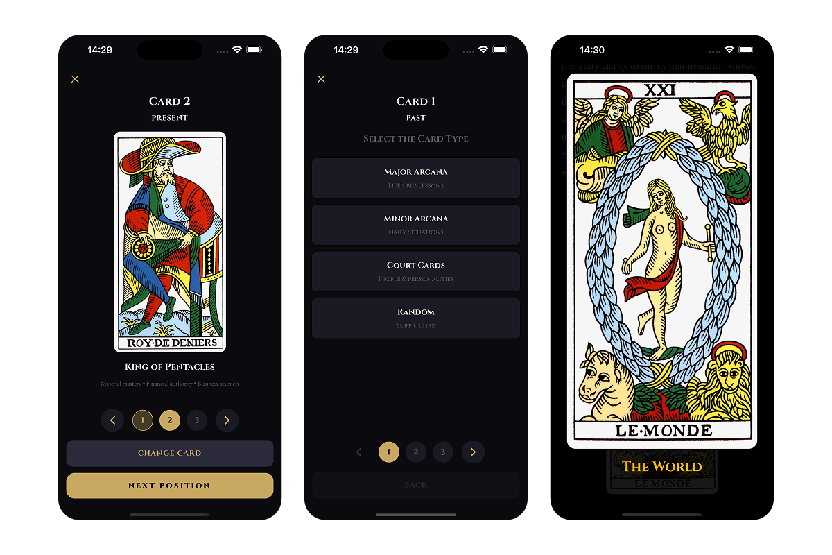
The Marseilles deck, with its dense symbolic imagery, offers a framework for externalizing internal questions. You bring a situation; the cards offer a lens; interpretation happens in the space between. A conversation with yourself, mediated by 78 pieces of cardboard that have accumulated meaning over centuries.

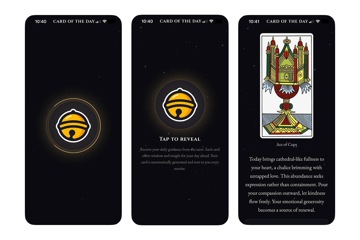
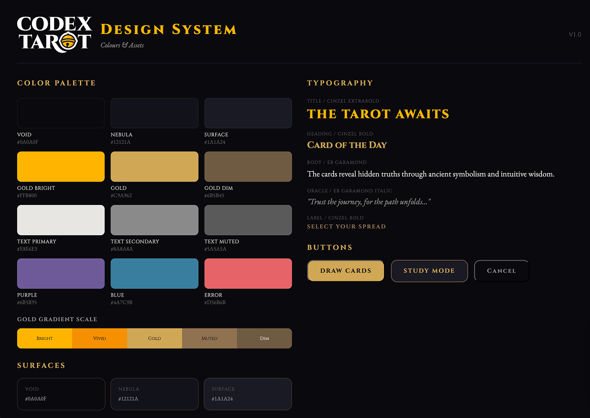
The web version proved the engine worked. Claude Sonnet, fed with comprehensive documentation I had written for all 78 cards, produced contextual readings that felt human and connected to the specific question rather than generic card meanings. Users described the experience as alive.

But web apps live in browsers and compete with tabs. They do not have icons on home screens or the legitimacy that comes from an app store review process. More importantly, they cannot send a gentle notification at 6:06 AM suggesting you take a moment before the day begins.

Mobile distribution changes the equation entirely. Google Play and the App Store are where people look when they want a tool. Being there signals legitimacy in a way a website does not.

Push notifications enable the Card of the Day feature: a gentle daily ritual that keeps the app relevant without being intrusive, creating an anchor habit that brings people back every morning.

The constraint that shaped everything: build it alone, build it fast, and get it through app store review. That last part turned out to be the hardest lesson. Apple sees tarot through a particular lens that required reframing the entire proposition.

Originally built for myself and a small circle of friends who were curious about tarot but put off by the mystical packaging and crystal-ball aesthetics. The mobile version has found a daily-use audience of about 20 active testers who open it every morning for their card of the day, ranging from complete beginners to people who have read tarot for years, and what unites them is a preference for reflection over pronouncement and a daily practice that takes two minutes but sets a tone for the hours ahead.

Creation

Three principles guided the rebuild. Each one responded to constraints and opportunities rather than assumptions about what a tarot app should be.

Keep the engine and change everything else. The YAML documentation, Claude integration, and contextual reading logic were all solid. Rebuilding that would have added months for no benefit. What changed was the container and the experience around it.

No frills and easy to use. Every feature had to justify its existence in under ten seconds of user testing. If someone needed an explanation, the feature was wrong.

Ship tight and expand later. Cut everything that was not essential to the core loop. No social features, no sharing, no advanced customization. Just draw cards, get readings, and build a daily practice. The constraint proved liberating: by aiming low, I avoided the complexity that kills solo projects. Nothing broke because there was less to break.

Card of the Day (DAWN)

The feature that has been really well received by users and become the anchor habit that keeps people returning. A single card draw with a focused, personal reading delivered at 6:06 AM via local notification, creating a gentle daily ritual that replaces the first scroll of the morning with a moment of reflection. No spread to choose and no question to type, just tap and reveal and sit with what emerges, with users describing it as the two minutes that set the tone for their entire day.

Card of the Day screen showing a single revealed tarot card with interpretation text against a nebula background
The daily ritual that has been really well received by users. One card, one reflection, no decisions to make, delivered at 6:06 AM.

Three-Stage Reading Flow

The core experience built around three sequential API calls to a Supabase Edge Function that unfolds like a conversation rather than delivering everything at once. First the analyze call generates the opening invocation and individual card analyses, then the synthesize call creates a cohesive interpretation combining all cards into a unified reading, and finally the oracle call delivers the mystical guidance that feels like the deck itself is speaking. Responses stream progressively for a magical reveal effect, with cards flipping as they enter the viewport and haptic feedback on every interaction.

Three-card spread reading showing individual card analyses and synthesis text
Three-stage reading flow: individual analyses, synthesis, and oracle guidance. The conversation unfolds progressively.

Fate and Study Modes

Two approaches to drawing cards that serve different user needs. Fate mode is the standard random draw for when you want the cards to choose, while Study mode lets you manually select specific cards and positions for exploration and learning, built for understanding how The Fool and The Tower interact or what happens when you place Death in the future position. Study mode is Pro-only because it serves the deeper practitioner, while Fate mode is available to everyone with the free tier offering unlimited one-card readings and limited three-card and five-card spreads per month.

Fate mode showing random draw and Study mode showing manual card selection
Fate mode for surrendering to the draw, Study mode for intentional exploration. Two paths to the same mirror.

Animated Card Reveals

The old web app showed cards instantly but the mobile version animates each reveal with a slow turn that builds anticipation and gives the moment weight, transforming the experience from functional to ritual. Cards are initially face-down and flip when approximately 30 percent visible in the viewport as the user scrolls, with React Native Reanimated handling the transitions smoothly and haptic feedback confirming each interaction. The cosmic background layers, StarField and NebulaLayer and FogLayer, create depth without distraction, and the typography pairing of Cinzel for headlines and EB Garamond for reading text reinforces the contemplative mood.

Freemium Monetization

A two-tier model that respects casual users while offering depth for those who want more. Free users get unlimited one-card readings and one three-card and one five-card reading per month, which is enough for occasional reflection without pressure to subscribe. Pro subscribers unlock unlimited spreads of all sizes plus Study mode for manual card selection, with RevenueCat handling the subscription infrastructure and a custom paywall UI that matches the app aesthetic rather than using off-the-shelf components. The model is working, with conversion happening organically as users hit their monthly limits and want to go deeper.

Custom paywall screen showing Pro tier benefits with cosmic background
Custom paywall UI matching the app aesthetic. Free tier is genuinely useful, Pro unlocks depth for those who want it.
User flow diagram showing Card of the Day, reading selection, and paywall paths
Three primary paths with monetization gates placed naturally. Daily card, guided spreads, or upgrade for more.

Craft

  • Kept the original YAML documentation and Claude engine because months of research on 78 cards, their meanings, relationships, and monologues was already complete and rebuilding that would have added months for no benefit. The engine was the one thing that did not need fixing.
  • Chose React Native and Expo for cross-platform reach with solo development, meaning one codebase for both stores without native platform expertise required. The trade-off was performance on older devices, acceptable for an app that is not graphically intensive, and the New Architecture enabled by Reanimated 4.x handles the animations smoothly.
  • Scoped ruthlessly to ship, meaning no database for user accounts and no cloud sync and no social features, just local storage and offline-first and immediate utility. The features that got cut, weekly reads and memory of past draws and user profiles, are planned for future releases once the core is validated.
  • Built Card of the Day as the anchor habit because the insight came from watching how testers actually used the app, opening it in the morning, drawing one card, and closing it. The feature was built to serve that behavior rather than invent a new one, with the notification time set to 6:06 AM and branded as DAWN.
  • Implemented RevenueCat from day one because monetization was part of the plan, not an afterthought. The two-tier model gives genuine value to free users while creating a clear upgrade path, and the custom paywall UI maintains aesthetic consistency.
  • Reframed the entire app for Apple review because the initial submission was rejected for astrology and divination content. The pivot to visual archetypes and meditation and self-examination is not just marketing but more honest to what the app actually does, with the cards serving as a mirror rather than a prediction engine.

The Apple rejection was the biggest surprise. I had assumed the app was clearly about reflection and meditation rather than fortune-telling. Apple's review team saw it differently.

The rejection forced me to articulate something I had believed but never stated clearly: tarot as visual archetypes is a tool for externalizing internal questions rather than predicting the future. The reframing made the app better by clarifying the onboarding, sharpening the marketing copy, and giving me language for the resubmission that is both more accurate and more defensible.

The other surprise was Study Mode usage. I built it convinced that people would love exploring card combinations manually. The data said otherwise: users prefer the guidance of a spread and the structure of positions with meaning. Study Mode stays for the subset who do explore, but it is not the main event.

These surprises are why you ship before you finish.

App Store rejection notice and the revised app description emphasizing meditation and visual archetypes
Apple rejection forced clarity. The pivot from divination to meditation and visual archetypes made the app more honest.

Outcome

Google Play approved and live with active monetization through RevenueCat. Apple Store resubmitted with reframed positioning emphasizing meditation and visual archetypes.

Approximately 20 active testers use the app daily, primarily for Card of the Day. Organic conversions to Pro happen as users hit their monthly free limits.

The feedback loop is tight: testers send screenshots, suggest wording improvements, and report edge cases. No major bugs, crashes, or confusion about core functionality.

The engine works. The design works. The monetization model is validated. Distribution is the remaining hurdle.

  • Card of the Day has been really well received by users and serves as the anchor habit, with people opening it every morning without prompting and the notification helping but the behavior being self-sustaining.
  • Study Mode is underutilized relative to my expectations because users prefer guided spreads over manual exploration, though it remains valuable for the subset who want to learn card relationships.
  • The Apple rejection, while frustrating, produced a clearer articulation of what the app actually does, with meditation and visual archetypes replacing fortune-telling in all positioning.
  • The freemium model is working with genuine utility in the free tier and organic conversion to Pro as users want more depth.
  • Testers range from tarot beginners to experienced readers and both groups find value, though for different reasons, with beginners appreciating the structure and experienced readers valuing the contextual depth.

Testimonials

1 / 6
Click to open
I just had an idea — you can add something like if you draw each day, then after 7 days, you receive something extra. I play a game where I receive daily items and if I login each day, on the 7th day, I get something extra. Somehow, this silly thing got me hooked to login daily 😄
Danny J.
Auto

Reflection

Shipping tight scope beats perfecting broad scope. By keeping features minimal, I avoided the complexity that derails solo projects. Nothing broke because there was less to break.

This lesson translated directly to my professional work. I now push harder for scope discipline after experiencing how much faster tight constraints enable shipping.

Production requirements exist for a reason. App store review processes, legal compliance for worldwide distribution, privacy policies, and terms of service serve as guardrails that force you to build responsibly. Feeling that pain personally, as a solo developer responsible for every decision, gave me empathy for the production teams I work with that no amount of reading could have provided.

The monetization decision was also instructive. Building it in from the start, rather than adding it later, meant the architecture supported it naturally. The two-tier model respects users by giving genuine value before asking for money.

Open Questions

  • Will the meditation and visual archetypes reframing satisfy Apple's review team, or is tarot inherently categorised as divination regardless of framing?
  • Can I add database features and memory and weekly reads without losing the simplicity that makes the app work?
  • What is the sustainable long-term model, subscription revenue or one-time purchase or something else entirely?

Gallery

Screenshots of tester feedback messages showing daily usage and feature requests
Active tester group provides daily feedback. The tight loop keeps iteration fast and grounded in real usage.
Codex Tarot design system showing color palette, typography, and card component specifications
New visual system for mobile. Cosmic backgrounds, Cinzel headlines, EB Garamond body text, card-first hierarchy.